
Your First Customer Success Dashboard
Piloting your success team's first dashboard for monitoring customer health

👋 Hey, I’m Jordan and welcome to a new edition of Momentum from Inertia. I explain topics spanning Customer Success, Marketing, Sales, and Service functions to help readers improve business outcomes, drive growth, and accelerate their careers. This week, I cover an example of a Customer Success Dashboard using basic Health Scores.
Why measure and monitor Customer Success at all?
Dashboards highlight key business information that help teams make important decisions around how they spend their time. For customer success teams — especially those with limited resources — prioritizing customers that are straying off-course from their goals is vital to team productivity and effectiveness.
Our goals for this dashboard are to provide a tool that can:
💰 Help determine which customers need proactive attention or intervention prior to churn, including what revenue may be at risk
🤑 Identify which customers may be well positioned for new offerings
🔍 Provide a centralized, accessible place for colleagues to find relevant customer information and insights and provide transparency for who is accountable for customer success
Start with the end in mind: Defining Requirements for your Dashboard
While there are many useful metrics that Customer Success teams track, based on our goals outlined above, we’ll begin with a handful of attributes that we know we’ll need before we add more…
🏢 Customer Name: The name of the customer which has bought products/services from your organization
💵 Annual Revenue: The total amount of revenue you expect the customer to spend on your products or services within the current fiscal cycle
👧 Customer Success Manager: The individual who is responsible or accountable for the customer’s success
Aside from the basics, we’ll also use a common framework amongst many customer success teams to measure overall customer success:
Customer Success = Outcomes + Experience
Outcomes: What an organization’s products or services help a customer achieve
Experience: How a customer feels while those outcomes are being achieved
For each of these dimensions, we’ll create corresponding scores which turn this equation into:
Total Health Score = Average( Outcomes Score + Experience Score )
For now, we will skip the details surrounding how both the Outcomes Score and Experience Scores are defined and collected, but note that we’ve chosen for each dimension to be a normalized numerical value. Let’s add these three additional attributes to our dashboard requirements:
🌡 Total Health Score: A 0 - 100 score which represents a Customers’ Total Health, obtained by taking the average of the Outcomes and Experience Scores.
📈 Outcomes Score: A 0 - 100 score which represents how well a Customer is achieving its’ goals using your products or services.
😍 Experience Score: A 0 - 100 score which represents how the Customer feels while achieving its’ goals.
Visualizing Your Dashboard
Let’s quickly identify how we’d like to start presenting this data so our Customer Success team can use this information to make meaningful decisions on a day to day basis. We’ll begin by outlining a need for 4 different dashboard pages, each with different purposes:
Customer Success Overview: Provides summarized information across all defined attributes
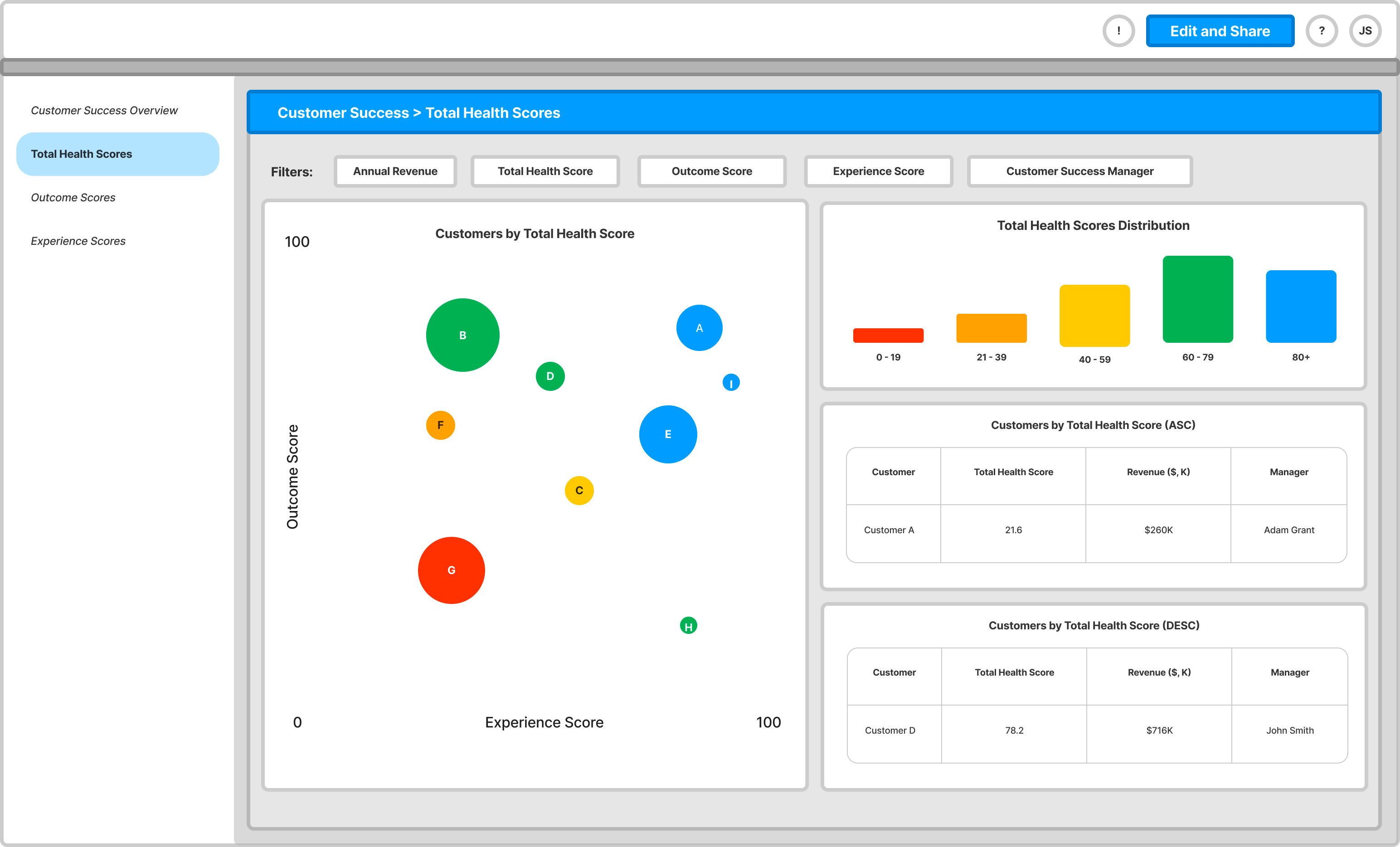
Total Health Scores: Provides actionable data based on how customers have scored across both outcomes and experience scores, as well as the distribution of customers amongst different quintiles.
Outcome Scores: Provides data based on how customers scored across outcomes, as well as the distribution of customers amongst different quintiles. Useful for pin-pointing actionable next steps for customer success managers to work with customers struggling to achieve outcomes.
Experience Scores: Provides data based on how customers scored across experiences, as well as the distribution of customers amongst different quintiles. Useful for pin-pointing actionable next steps for customer success managers to work with customers struggling to achieve outcomes.
Let’s also outline how we may want to slice our data to reveal different insights (using filters):
Annual Revenue: Allows for dashboard viewers to include/exclude certain companies based on if they fall into a specific Annual Revenue range (for example:
Annual Revenue > $250k
Annual Revenue between $100k and $500k
Annual Revenue < $100k
Total Health, Outcome Score, Experience Score: Allows for dashboard viewers to include/exclude specific customers based on how they’ve performing against the health scores (for example:
Customers with Total Health Scores < 80
Customers with Outcome Scores > 50
Customer with Experience Scores < 60
Customer Success Manager: Allows for dashboard viewers to include or exclude customer based on who the assigned Customer Success Manager is
Below, you can find FigJam mockups of what each of these pages might look like in a Looker Studio format:
Customer Success Overview Page:

Total Health Scores Page:
Outcome Scores Page:

Experience Scores Page:

Using Your Dashboard
Enjoying this edition of Momentum from Inertia? Subscribe now to receive future updates, including a guide on using these dashboard pages as a part of your Customer Success team’s day to day operations.